"What is Apple, after all? Apple is about people who think 'outside the box..."
That's how Steve Jobs described his company.
This "thinking outside the box" approach was reflected not only in how the company revolutionized the tech industry but also in how it developed its logo.
Apple's logo has experienced a few changes since the brand's inception. Some changes happened because the company re-jigged its mission, and some changes were purely aesthetic.
But, looking at the lineup of Apple logos over time, we can confidently say that this change shaped the brand's image, recognition and iconic status today.
Let's dissect Apple's logos one by one and see how the famous fruit found its place in the hearts and lives of 1.2 billion users.
Are you a little bit of a nerd for big brand logos? We take a similar look at the Starbucks logo. You might like it.
The History of the Apple Logo
The apple falls
In 1976, Ronald Wayne, one of the 3 co-founders of Apple, decided to take a scientific approach to the brand's logo design.
The original logo showed Isaac Newton sitting under a tree with an apple hanging above his head and an inscription that read, 'Newton… A mind forever voyaging through strange seas of thought alone.' Newton founded the law of universal gravitation when that apple fell on his tree, making him one of the most outstanding/noteworthy scientists.
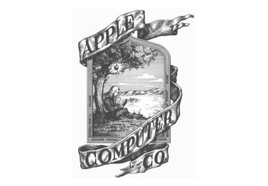
We think Wayne wanted to convey the fact that Apple is forward-thinking, smart, and that they want to make something truly different. Unfortunately (although the designers in the room might be thinking fortunately), this logo didn't hang around for long. And neither did Wayne.
The apple gets bitten
When you saw the above logo, you probably thought, "wow, that's old." That's precisely what Steve Jobs thought too. And since the company was moving towards innovation and modern design (especially with the new gen of Apple computers), the logo had to change too.
In 1977, Jobs hired Rob Janoff to make a new logo. The task was to create something modern and simple. And that's how the famous bitten apple came to be.

This version still had Apple's name in the logo and a rainbow pattern on the apple itself.
The apple becomes an icon
Jobs believed in simple and minimalistic design - both when developing apple devices and the company's logo/branding.
So in 1984, the brand's name got removed from the rainbow logo, leaving only the apple icon. This icon laid the foundation for the future Apple logos and stayed there for the next 10 years.

Jean-Louis Gassee, a former Apple executive, once commented:
"One of the deep mysteries to me is our logo, the symbol of lust and knowledge, bitten into, all crossed with the colors of the rainbow in the wrong order. You couldn't dream of a more appropriate logo: lust, knowledge, hope, and anarchy."
That's what Steve meant by "thinking outside the box," right?
The apple gets redefined
Apple's logo history at this point was closely connected to what was happening at the company. In 1985, Jobs had to leave Apple. He came back in 1997 because the brand was losing money fast. So the work to revamp the brand, along with its logo, began.

The rainbow pattern got swapped for a solid black. This color choice aligned with the new, sleek design of the new Apple computers: all made in grey, white or black.

In 2001, the aqua apple logo design came out. It had a 3D vibe, similar to Apple's new iPod look.

The color palette has practically stayed the same ever since. The chrome version appeared in 2007, and the current grey logo was born 10 years later, in 2017.
Bustin' myths
The Apple logo is so iconic that it started a whole bunch of stories and myths about its hidden meanings.
The Alan Turing myth
One of them is that the apple is actually connected to a famous scientist, Alan Turing. If you know a bit about science, or at the very least you’ve watched The Imitation Game, you probably know that Turing basically created the first-ever computer. But it's Turing's death that created a link to Apple's logo. After being threatened with being chemically castrated for his homosexuality, Turing allegedly bit an apple injected with cyanide, which led to his death (though the reason for his death is still all speculation).
Since Apple was into revolutionizing technology, it's no surprise that a few people thought their logo (the rainbow one) was a tribute to Turing.
As beautiful as this theory sounds, it's not true. Rob Janoff later said, "I'm afraid it didn't have a thing to do with it. It's a wonderful urban legend." The Apple II was the first home or personal computer that could reproduce images on the monitor in color. So it represents color bars on the screen."
The Bible myth
Another theory was connected to the Biblical story of Adam and Eve or more to Eden's forbidden tree of the knowledge of good and evil. Again, Janoff said "no" to this theory.
Janoff, however, does explain why the apple shape looks the way it does; turns out it was all about the practicalities of the design scale. The apple has a bite because otherwise, it'd look like a cherry. This little apple emoji kinda proves that 🍎 - looks like a small cherry, right?
And it was a nice coincidence that there's also a computer term "byte".