We’ve all heard the phrase “Don’t judge a book by its cover.” But back in 2017, Little Brown Group, a publishing company, found that 52% of buyers decide to buy a book by looking at its cover. So, while not judging a book by its cover is good advice regarding people, it's literally how consumers purchase books.
Don’t you think the same principle applies to buying a new product? You don’t just pick up a random chocolate bar when you’re at a grocery store. You either look for the one you already know or the one that piques your interest. You look at the colour of the package, the message, nutritional information, or pictures. Only after you decide that this package meets your standards do you actually buy it. You judge it by its “cover.”
So what does this mean for brands? It simply means that the stakes are high for them every time a potential customer makes a purchasing decision (in-store or online). Competing brand packaging needs to outshine each other and grab the fleeting attention of the customer.
Not every product packaging can win in this fierce competition. And oftentimes, the issue lies in the fact that the package simply doesn’t speak to the consumer’s needs.
We’ve already talked a lot about why you need to start testing your package designs. But now the question is, how do you correctly test your package to reflect your customer’s needs and motivations?
This post will highlight 4 things to watch out for when testing your packaging. We’ll also provide some tips to help you avoid these mistakes.
Mistake #1: Testing similar package design mock-ups
It’s easy to just create one sample mock-up, change one design element in each variation, put them all in the questionnaire and call it a day. But this decision might not be the best one because it means you don’t give people many options to choose from. What if the respondents like your pack’s fonts but don’t like the logo placement? Or do they love the image but hate the copy?
Packaging consists of so many elements (e.g., images, claims, logos) that it’s simply not wise to test similar designs. You limit your creativity and are likely to get inaccurate survey results.
Hot tip: Always try to create several design mock-ups that cover a variety of different colours, logo options, images, and claims. When you get the results, you’ll see some patterns and trends by looking at the ideas that people liked most and least. You can then decide the mock-up you’re going to go with in-market.
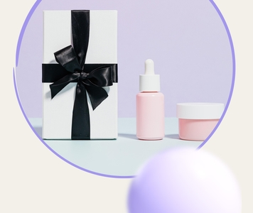
Upsiide’s Idea Map is the perfect tool for identifying which packaging designs people love most. When we tested plant-based protein packages, the Idea Map revealed that respondents especially liked package ideas that conveyed associations with being healthy (e.g., green colours and natural photography). This result demonstrated that if plant-based protein brands want to be perceived as healthy and nutritious, they should adhere to the packaging style of brands in that “healthy” category.
Mistake #2: Testing only existing designs
In a way, this mistake derives from Mistake #1. Often we find clients testing package design ideas they have already designed before. They use existing logos, colour palettes, and claims because they have been using them for the last 10-20 years.
But this error, just like the previous one, might have costly consequences. You don't give your design team room for creativity, so the ideas you test out are old and uninspiring. As a result, the answers you will get from respondents will be unmotivating.
Hot tip: Create a bunch of custom packaging designs that are completely different from what you have now. Experiment with other colours, find original images, or flip your messaging upside-down. You can even add a few notes next to your idea about it being eco-friendly. Who knows, maybe you’ll realize that the problem lies not in the design itself but because the copy doesn't touch on the issue of sustainability.
Mistake #3: Using only one methodology
While it’s good to have one reliable methodology that you always come back to when you need to test package designs, it’s not the best practice. For instance, if you use an idea screen platform, it will only ask people which idea they like in isolation and give you a final numeric value.
But shoppers don’t choose products like this. They look at them all at the same time while they browse. They pick up the package off the shelf or click on the product page for more details. They read claims and analyze if that’s something that aligns with their needs. The experience is much more complex and composite. That’s why you need a variety of methodologies and platforms in your stack to capture this experience.
Hot tip: Explore other platforms and tools to diversify your research stack. If you want to get qualitative feedback about the functionality of your ideas, conduct focus group interviews. If you want to get feedback from a crowd of people but have limited resources, a platform like Upsiide is a great and affordable tool to learn how people feel about your idea. And the best thing is that you can actually get some deep quantifiable insights about your target audience in a matter of hours.
But if you want to see how your target audience makes decisions in the real environment, we’d recommend opting for something like Virtual Marketplace, which is offered by our parent company, Dig Insights. Virtual Marketplace mirrors a typical e-commerce shopping environment. The respondent simply shops for products as they would in real life. This methodology has helped us capture the way people actually shop, creating a more engaging customer experience..
Mistake #4: Narrowing down design options too early
We talked about this mistake in the context of concept testing, and we think it can also be applied here.
Often, it’s tempting to just conduct one package design test and choose only the top-performing ideas. But that’s a rookie mistake. You discard all the ideas that may not have done well because they simply need some improvements in their form or description.
Say you tested out packaging ideas A, B, and C, and found that B is the worst-performing one. Your immediate action might be to just remove that idea from all your future tests. But what you might not realize is that idea B is actually not that bad. All you need to do to improve is to redesign its logo placement, just like in ideas A and C.
Hot tip: Don’t think of low-performing ideas as bad. Think of them as needing some refinement. Put all the ideas that landed at the bottom into a separate list and work with your design team to improve them, using the insights you got from your test. Then, go back and repeat the testing process. You’ll be surprised to see how those “bad” ideas do in the second test.
Packaging design testing is a process of trial and error…
…but once you get familiarized with these common mistakes, you’ll be able to spot them and find a way to avoid them the next time you test your packaging.